Brand identity / Science & community
PENKALA
CONNECTING SCIENCE
An identity for a community connecting Croatian scientists and researchers — across borders, institutions and disciplines.
01 / The context
SHARED INTERESTS. MISSING CONNECTIONS.
Penkala brings together people who research, question and create new knowledge. Some work in Croatia, others abroad. Some in universities and institutes, others in industry.
They share plenty of interests, but do not always know about each other or the work they do. The identity needed to make that ambition to connect visible: credible for a scientific community, open enough to invite participation.
The name / The inspiration
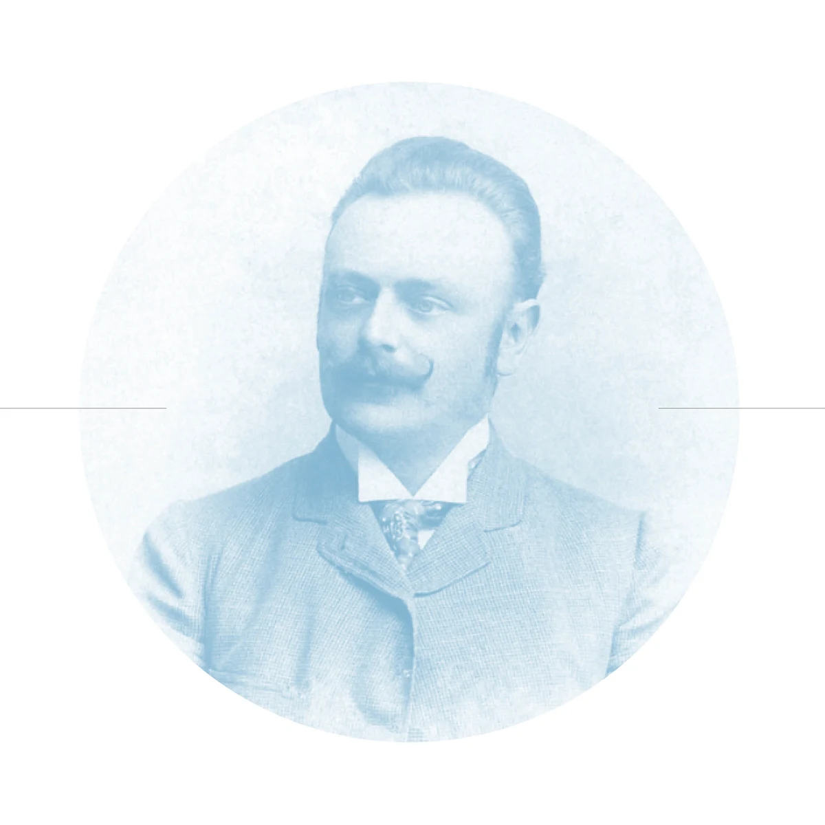
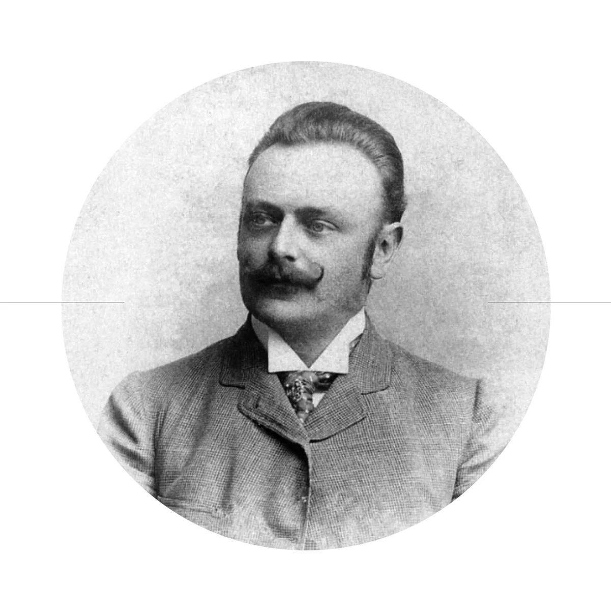
EDUARD
SLAVOLJUB
PENKALA
An inventor’s name. A new generation’s connections.
The association takes its name from Eduard Slavoljub Penkala. His legacy of research and invention becomes a starting point for a community looking ahead.
02 / The concept
CONNECT THE DOTS. OPEN POSSIBILITIES.
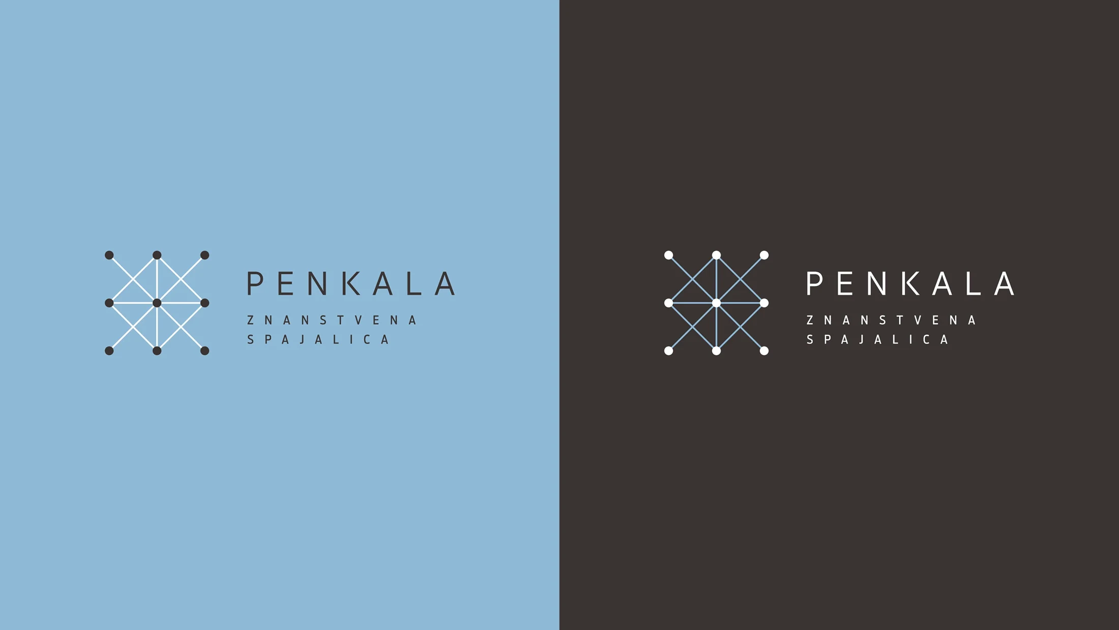
“Znanstvena spajalica” puts Penkala’s purpose into two words: a connector for science. A place for encounters, exchanging knowledge and collaboration — where a conversation can become a shared project.
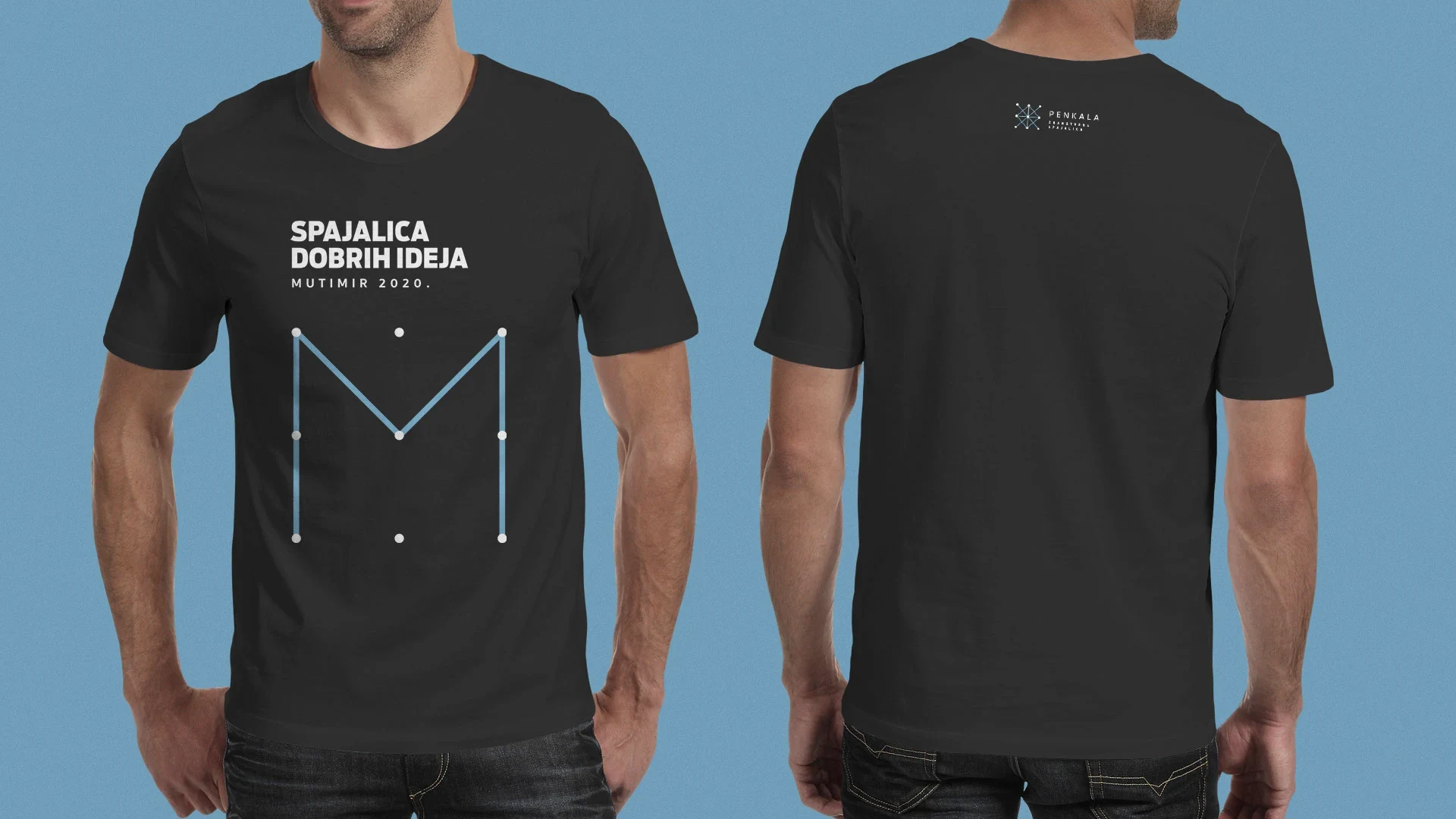
Nine points and the lines between them form the symbol. They stand for people, disciplines and ideas. Connected, they become a network: a visual expression of a community built through relationships.
03 / Participation
ONE COMMUNITY. A PERSONAL SIGNATURE.
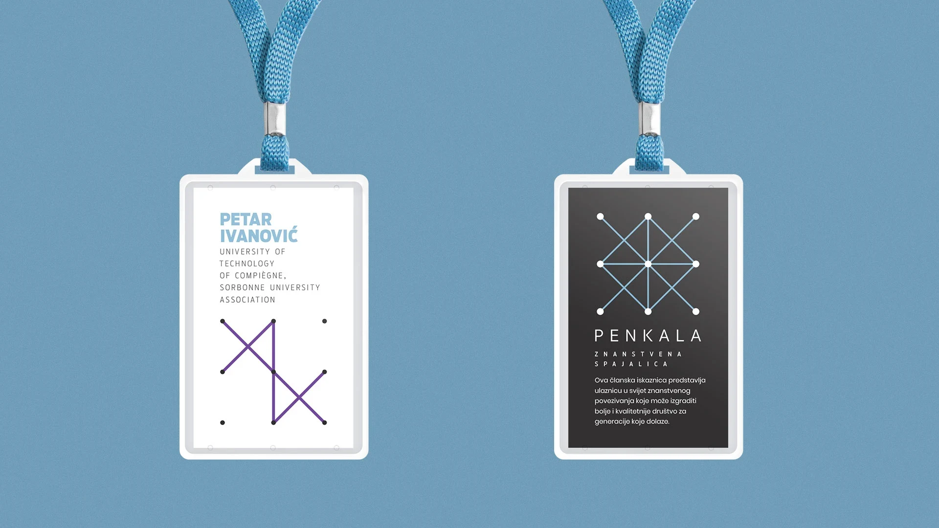
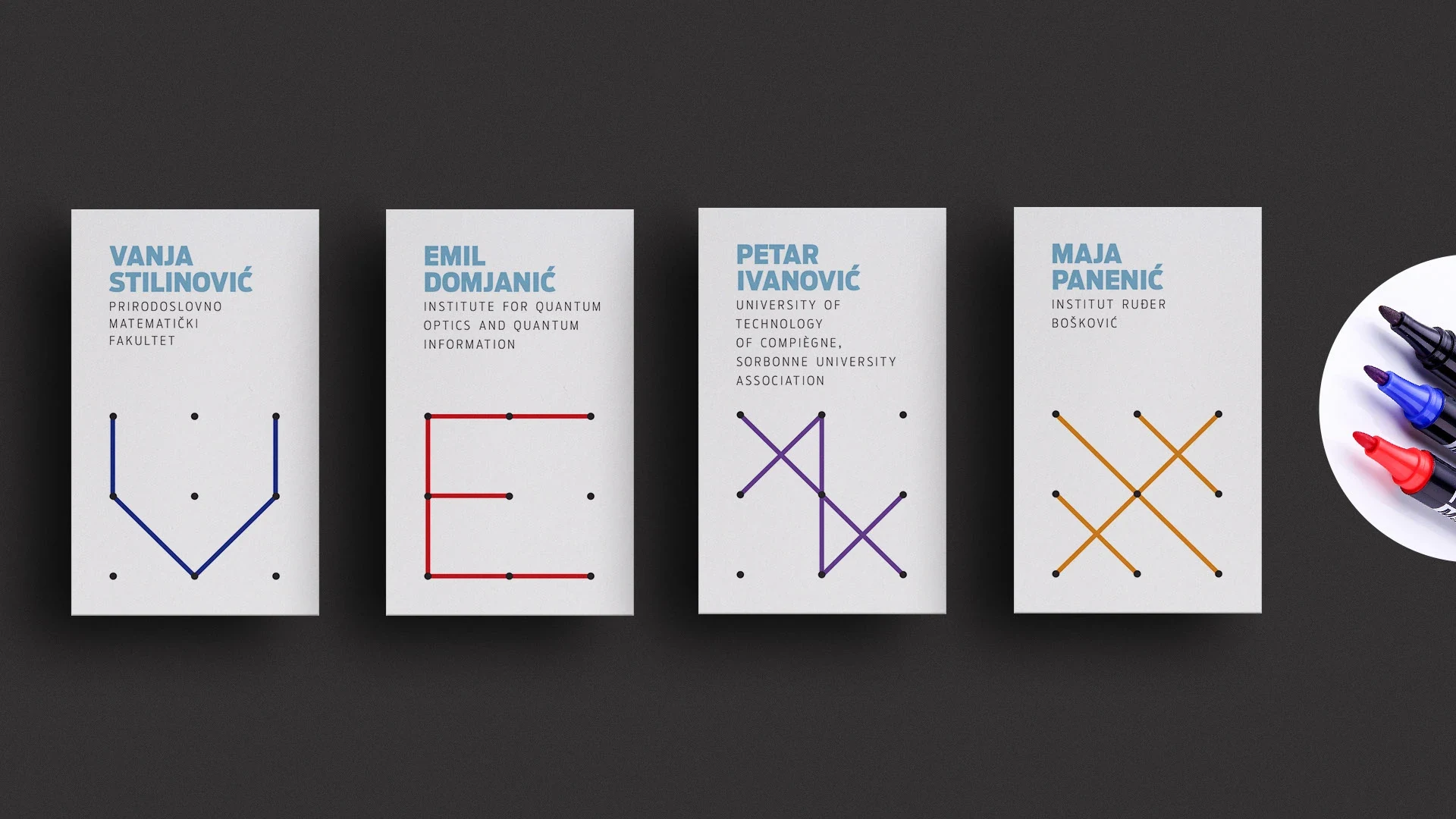
On membership cards, the identity becomes personal. Members can connect the points to create their own symbols, taking part in the design of their card.
A shared system stays recognisable, while everyone leaves their own mark. A small gesture that turns the association’s purpose into an experience: connection starts with participation.
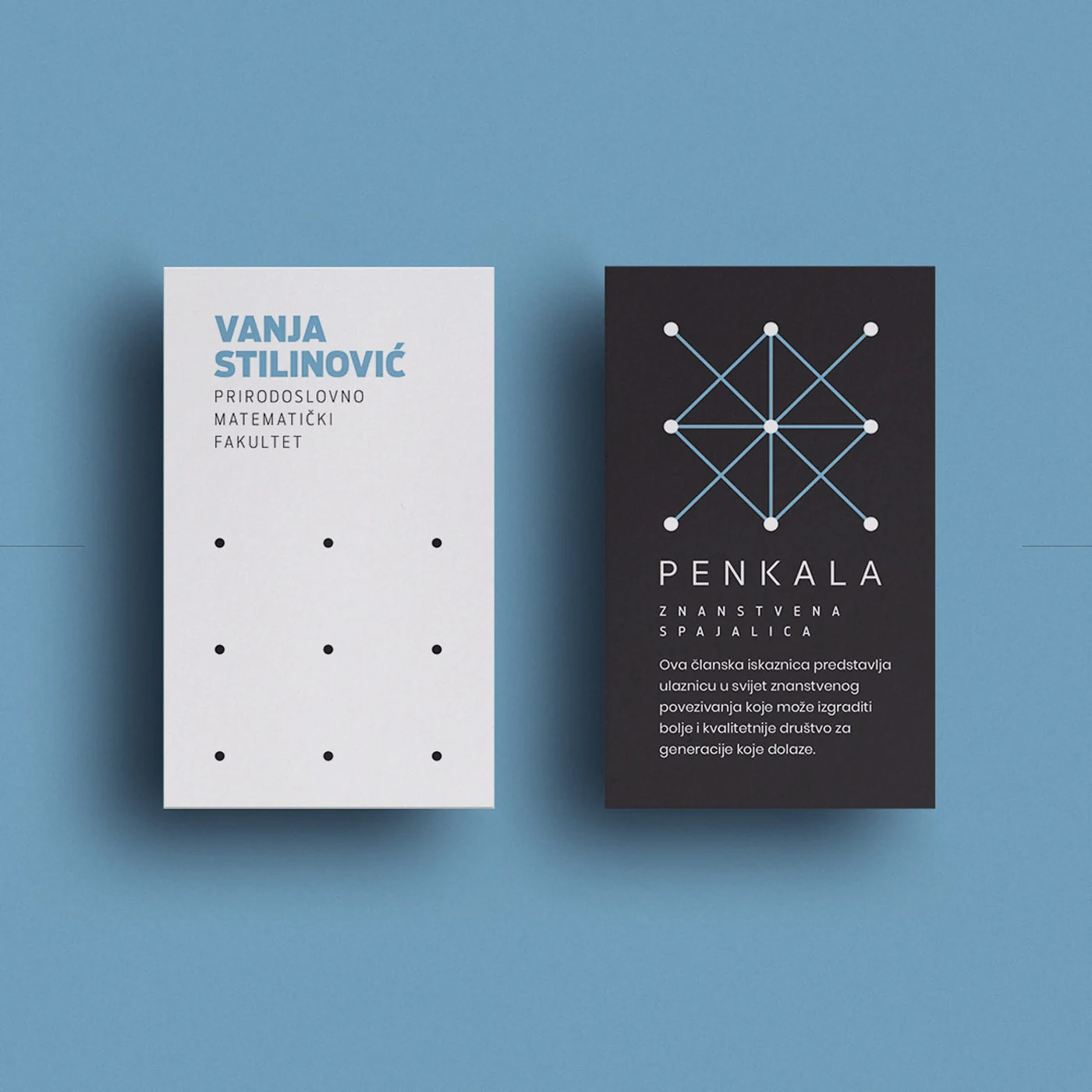
Membership card / Personalisation
NINE POINTS.
YOUR MOVE.
A shared starting point. A different connection for every member.
04 / The visual language
CLEAR FOUNDATIONS. ROOM TO PLAY.
Light blue, dark grey and white form the core palette. The geometric Poppins typeface echoes the structure of the symbol, while personal interventions introduce extra colour and character.
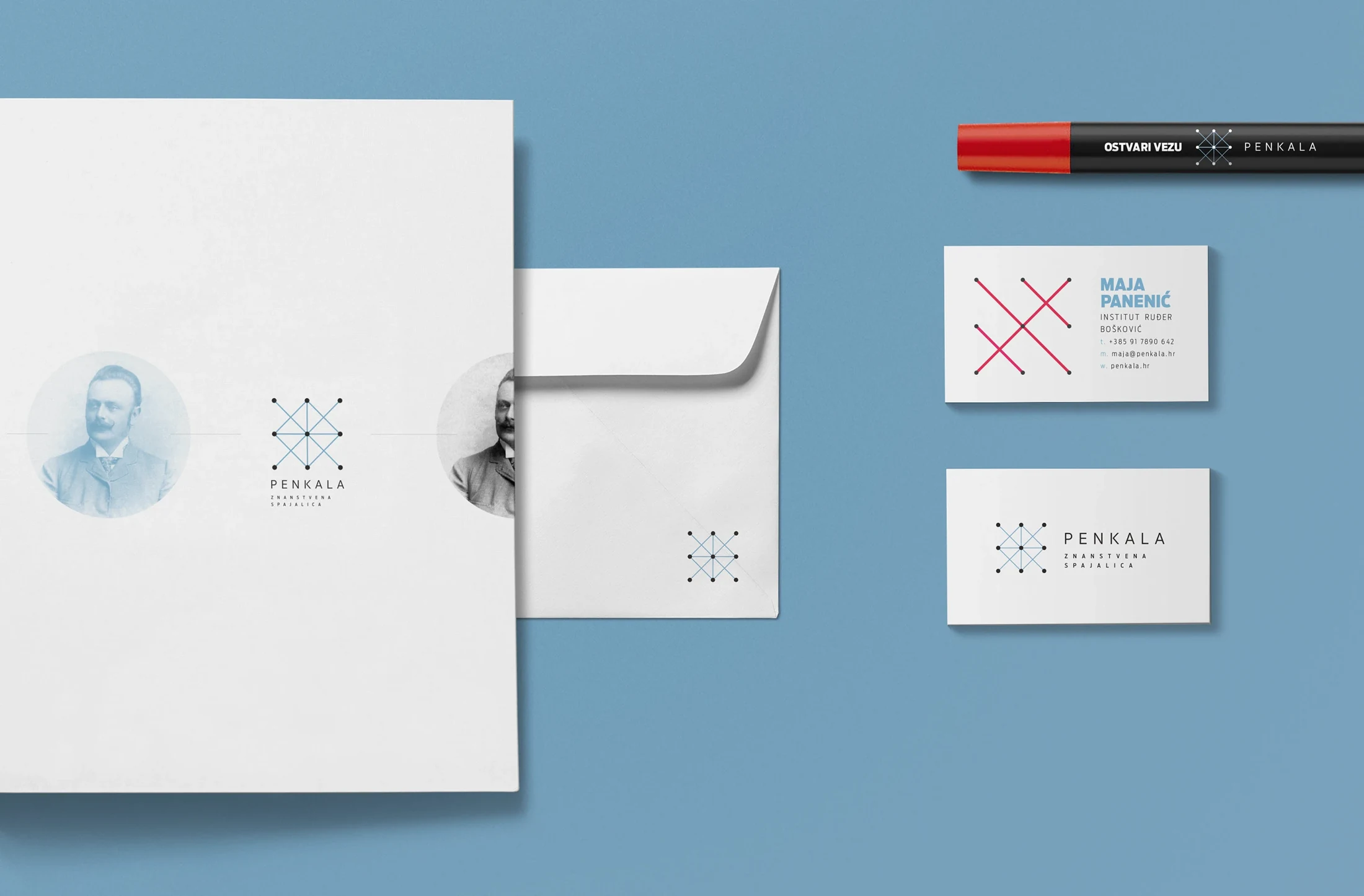
The association’s name, inspired by Eduard Slavoljub Penkala, connects the identity with a legacy of research and invention. His portrait appears as an additional element in applications.
05 / In the world
FROM MEMBERSHIP TO MEETING.
Business cards, stationery, badges, T-shirts and promotional items carry the same idea into different settings. The symbol becomes a graphic language that can be connected, rearranged and adapted.
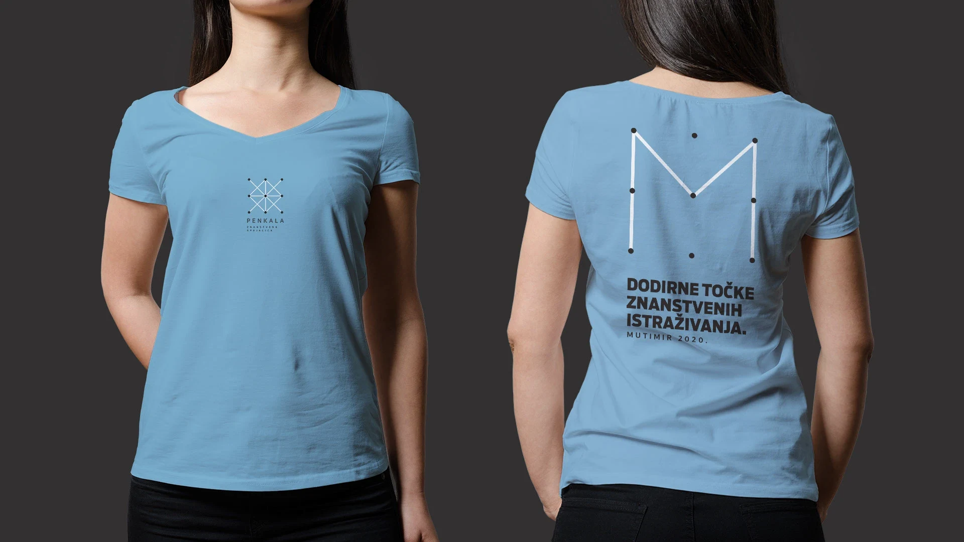
Messages such as “Ostvari vezu” and “Spajalica dobrih ideja” extend that language into words. Every application leads back to the same thought: knowledge gains new value when it finds the right connection.
Next step