Question the starting point.
Evaluate the proposed webshop before treating it as the answer.
Selected work / Kartik
Strategy → Identity → Web
A clearer brand.
A business-led direction.

01 / The brief
Kartik approached the project with two ambitions: refresh the brand and launch a webshop.
Before moving into design, I researched the market and assessed whether direct-to-consumer e-commerce was the right direction for the category. That work changed the brief.
02 / The strategic decision
The research led me to recommend a different route: a fully B2B focus. For Kartik’s category, a webshop did not appear commercially justified. The rebrand and website were developed around that decision.
Defining the business
Kartik is the parent company that creates, owns and distributes its own brands, with production entrusted to trusted partners.
Evaluate the proposed webshop before treating it as the answer.
Orient the business and its communication towards retail and distribution partnerships.
Translate the B2B direction into a coherent identity, website and content.
03 / Visual identity
The name stayed. The visual language became calmer and more consistent, with a geometric wordmark, warm neutrals and a restrained gold accent.
The mirrored first K pairs with the final K, a subtle reference to a pair of socks. The identity is supported by clear rules for typography, colour and everyday communication.

Every day. Every occasion.
Clarity in every detail.
04 / The system in use
The identity extends into business communication: cards, correspondence, offers and a consistent email presence.
05 / Website & content
The website follows the strategic direction: introduce the business, make the range easier to explore and provide a clear route to an enquiry.
The project also included content writing and copywriting for the website, shaping the brand introduction, product information and calls to action around Kartik’s B2B direction.
Brand presentation, product information and the contact journey work together. The site supports a conversation with Kartik rather than a checkout.
Explore the live website ↗A structured collection with product details, colours and sizes.
A coherent presentation of the company, its brands and its offer.
Direct contact and an enquiry form for product and partnership questions.
06 / Editorial imagery
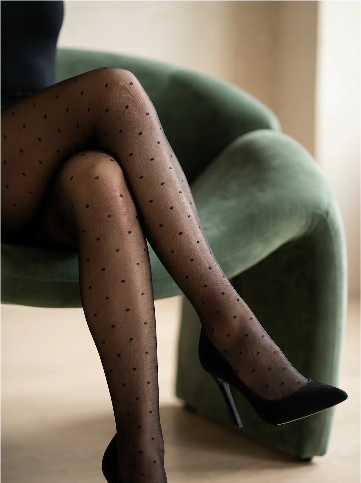
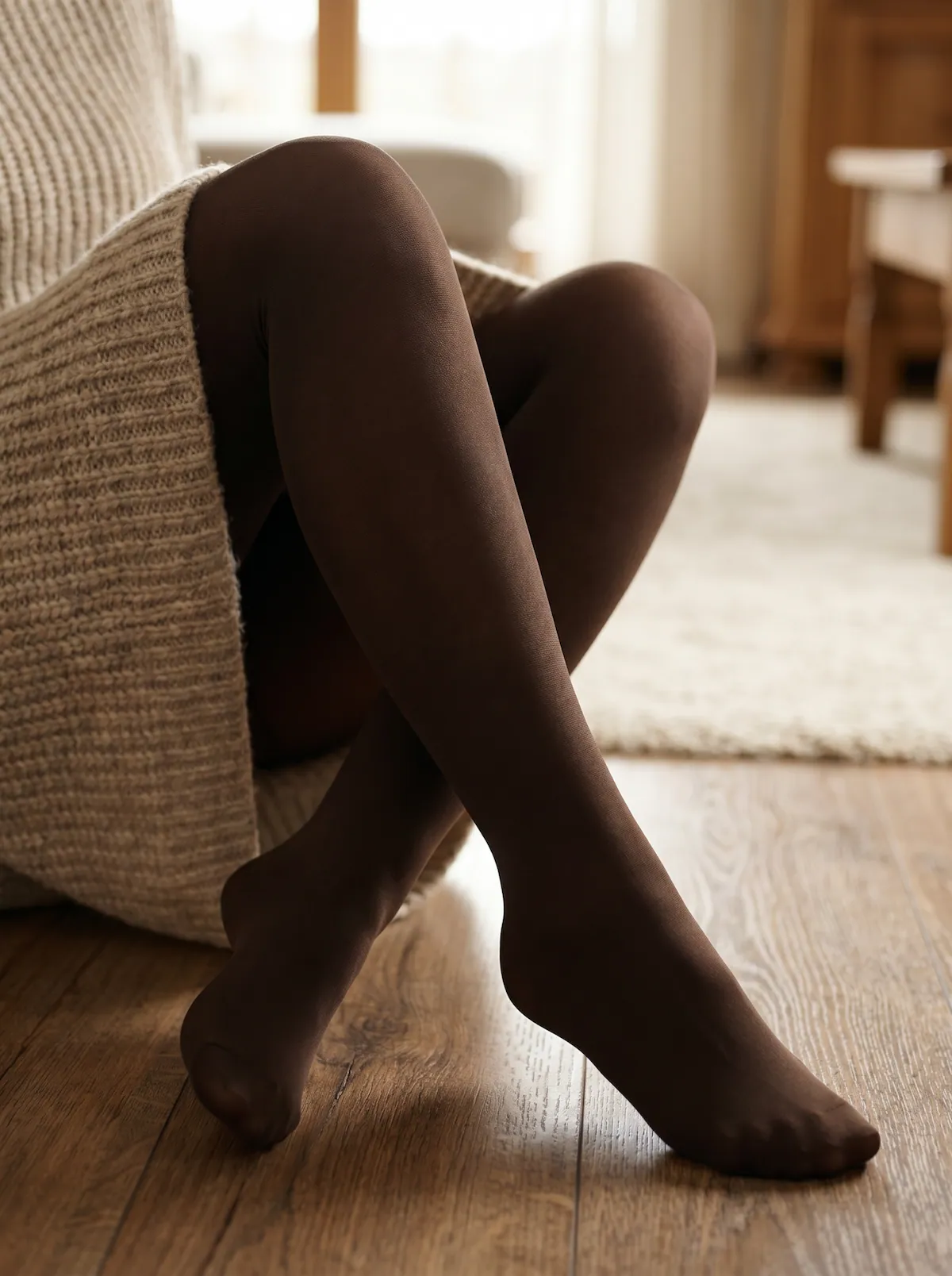
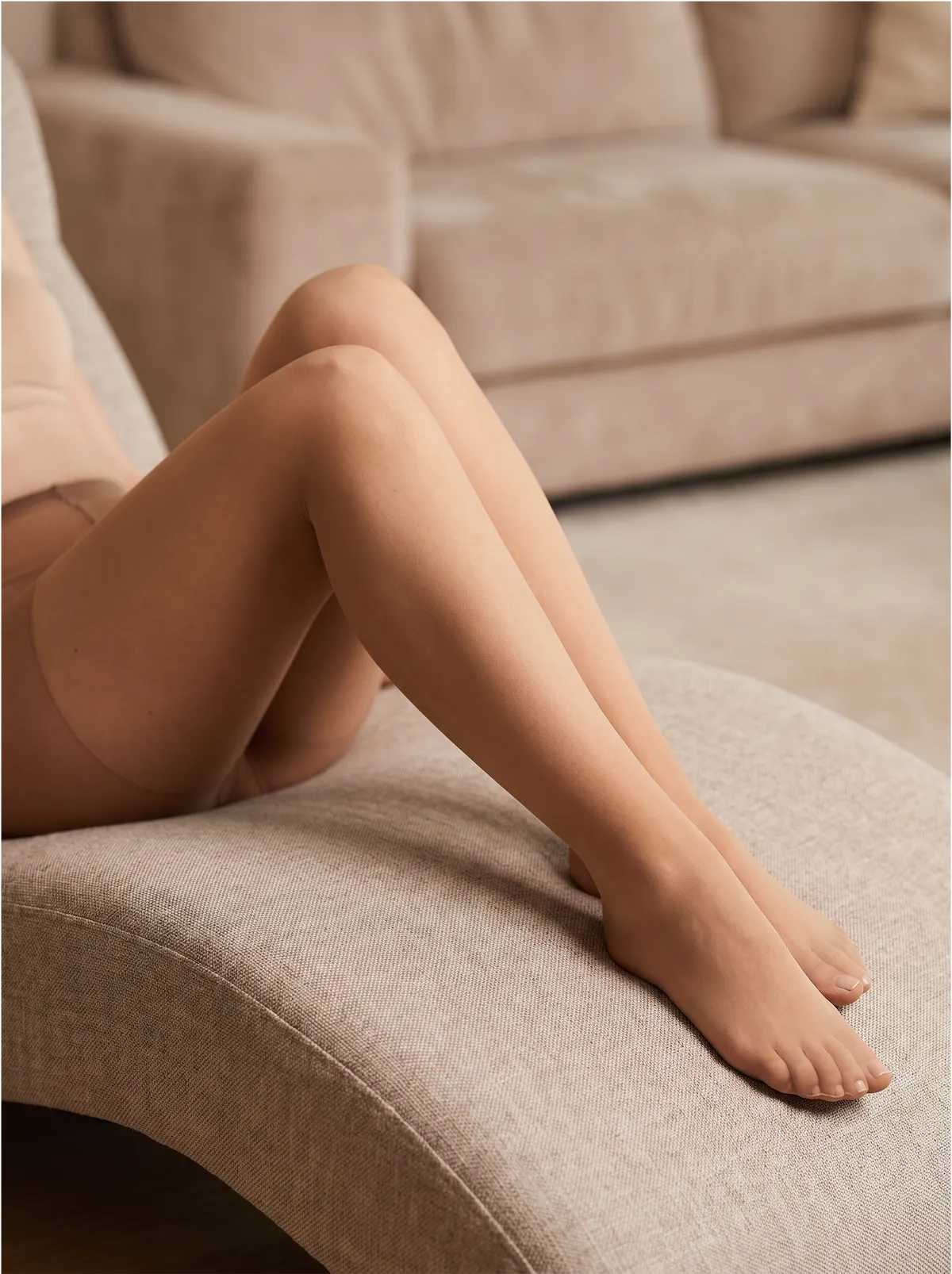
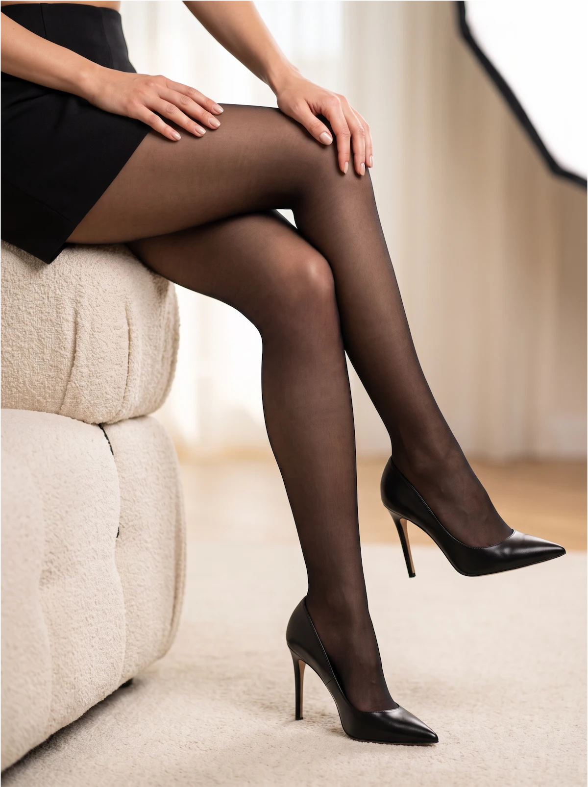
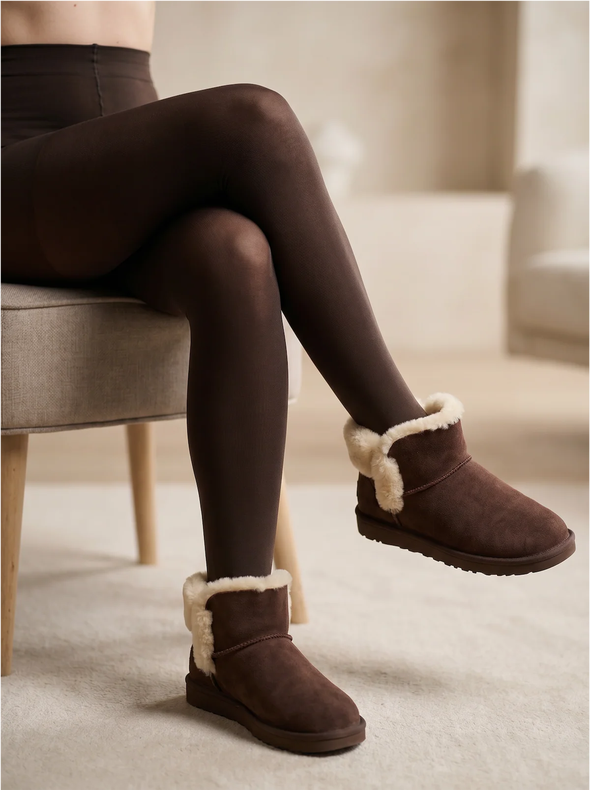
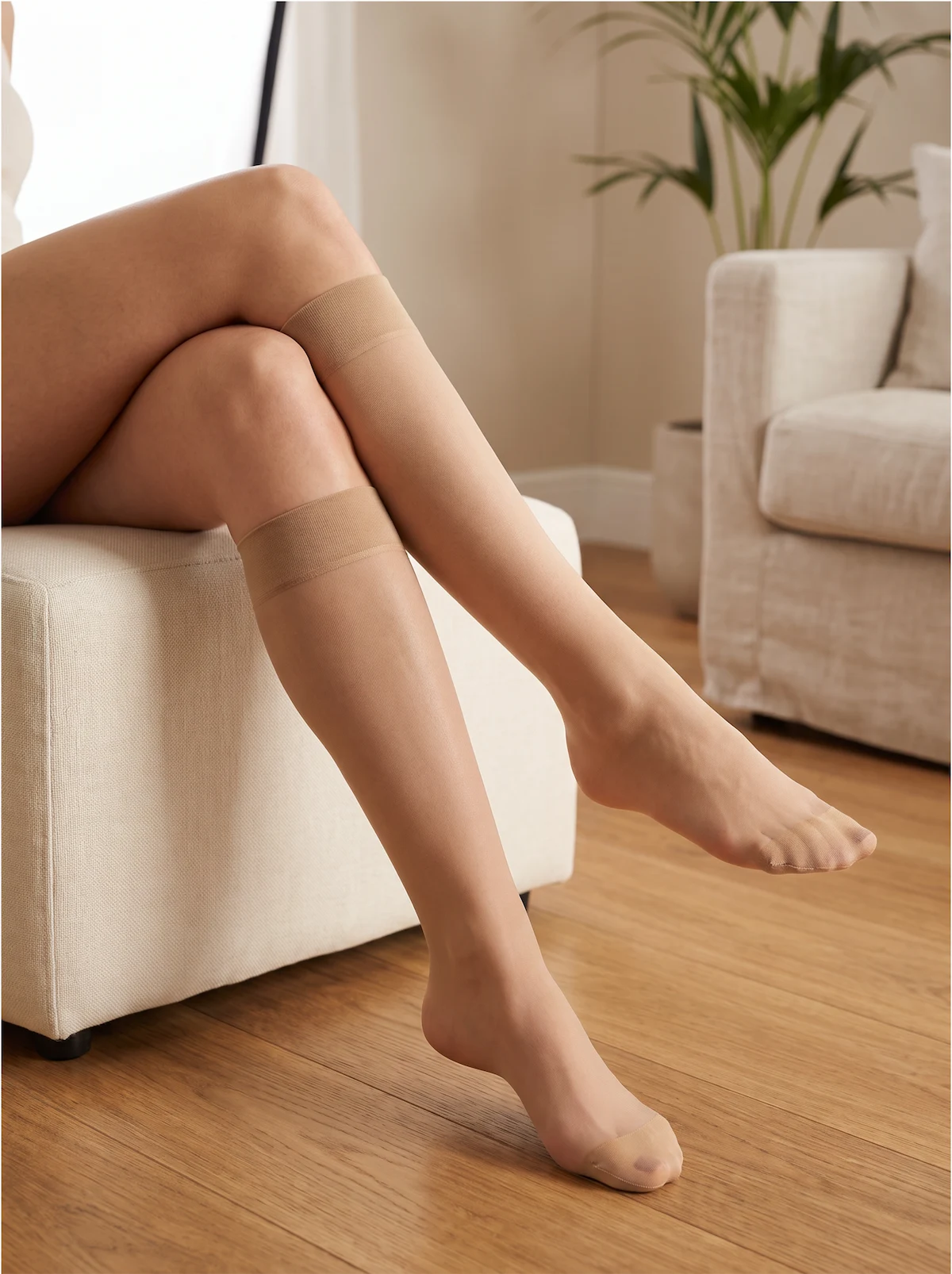
Using photographs of the actual products as references, I generated AI-assisted editorial imagery for the new website.
The images place the collection in a consistent visual world, extending the new identity into product storytelling and website content.
The project in one line
A B2B direction, a refreshed visual identity and a website built around the way Kartik chose to do business.
Next step